E-commerce Shop Design/ Ellies Market
Role
UX/UI Designer
Shopify Setup Lead
About
Ellie’s Market is a playful, sister-run brand featuring hand-illustrated stationery, embroidery kits, and workshops hosting.
The goal of this project was to design a Shopify e-commerce site that captured the brand's personality, but also provided a smooth, intuitive shopping experience to support their expanding audience.

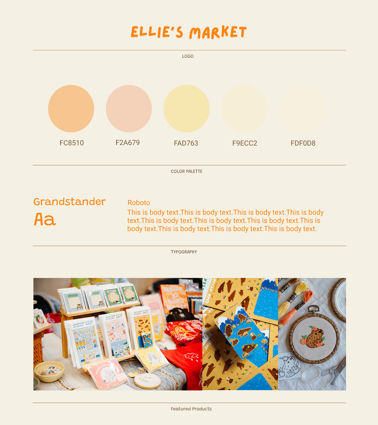
01. Brand Direction

Is playful and crafty.
The visual identity was designed to reflect that spirit:
Colour palette leans into soft, sunny pastels and a handmade charm that mirrors the products.
Typography I paired Grandstander for headings with Roboto for body text.
Grandstander’s bubbly, retro-inspired curves matches brand’s whimsical personality, while Roboto offers clean readability for practical details.
Photography of Ellie’s market displays and product textures guide the site’s look and feel—bringing brand personality into the digital experience.
This branding foundation informed EVERY design decision, helping us build a website that feels just as cozy and delightful as browsing Ellies’ Market in person.
02. Design Review & Iterations
First Design Review:
In our first design review session, I presented the initial layout based on our earlier conversations and the client’s design preferences. The goal was to bring her vision to life while offering UX guidance to enhance both usability and clarity.
Slideshow

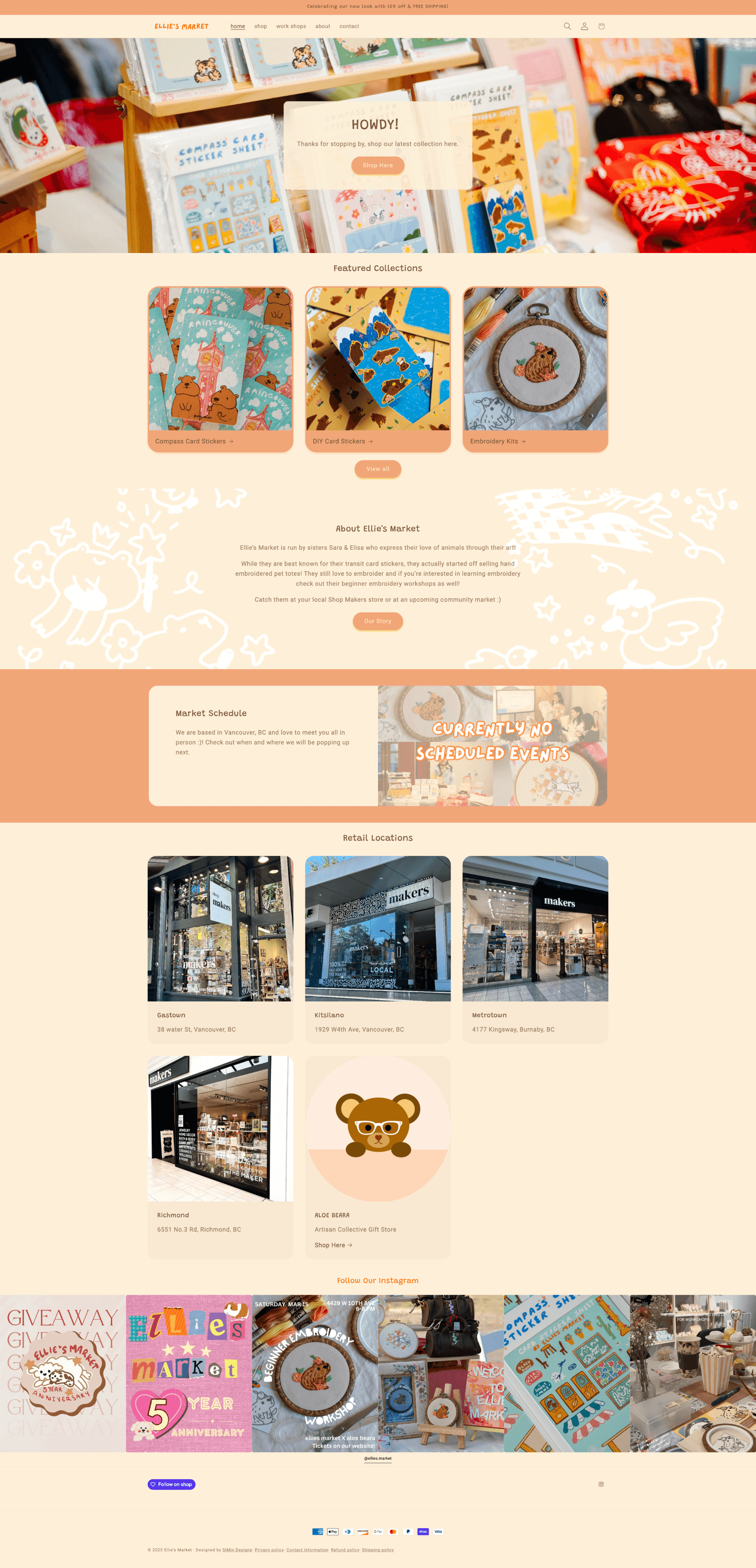
Market Schedule & Retail Locations
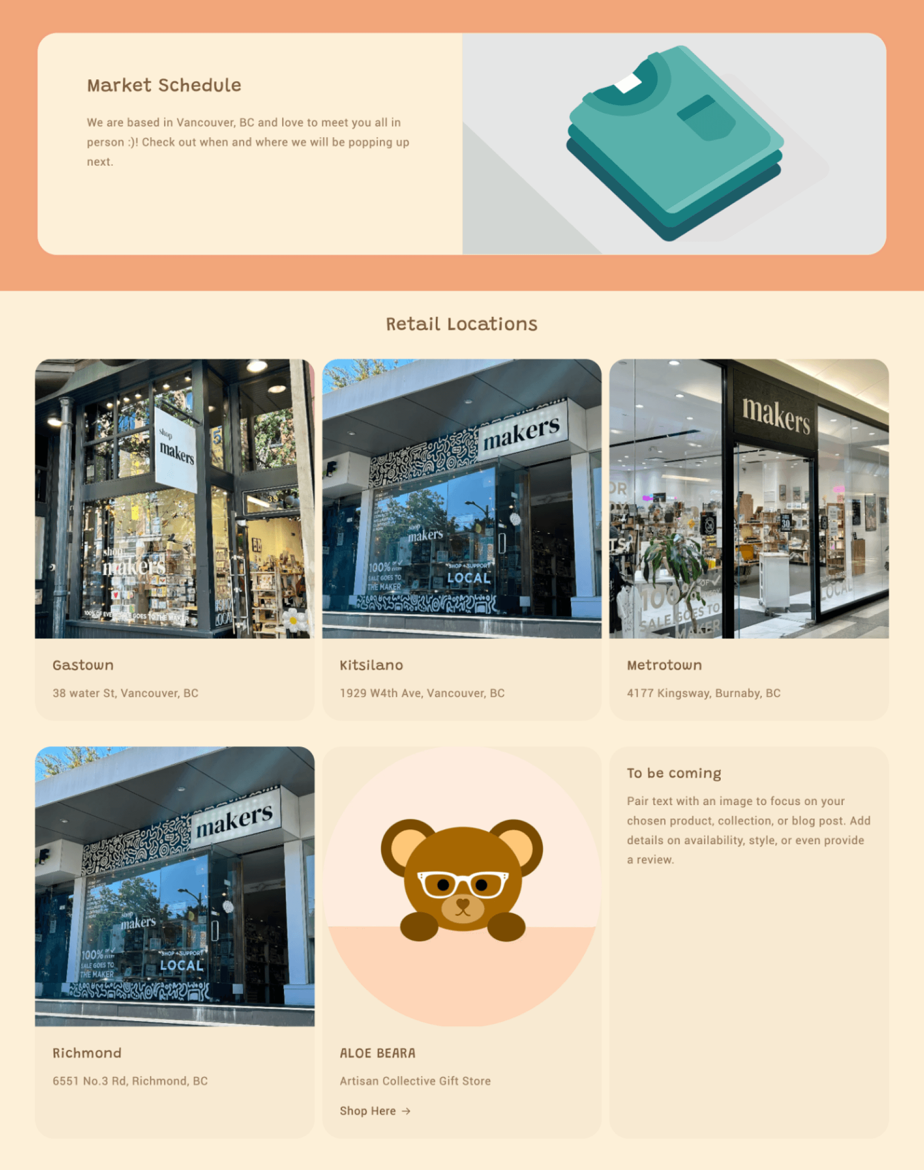
Recommendation 2:
The Market Schedule and Retail Locations were initially combined into one section in the provided copy.
I recommended separating them into two distinct sections.
Second Design Review:
After our first round of feedback and revision, we decided to remove the homepage slideshow due to its distracting nature and lack of a clear action.
While this improved clarity, I noticed in the second revision that the site now lacked a strong introductory presence.
To address this, I proposed adding a dedicated introduction section. This section would:
Quickly introduce Ellie’s Market and its story
create more personal experience
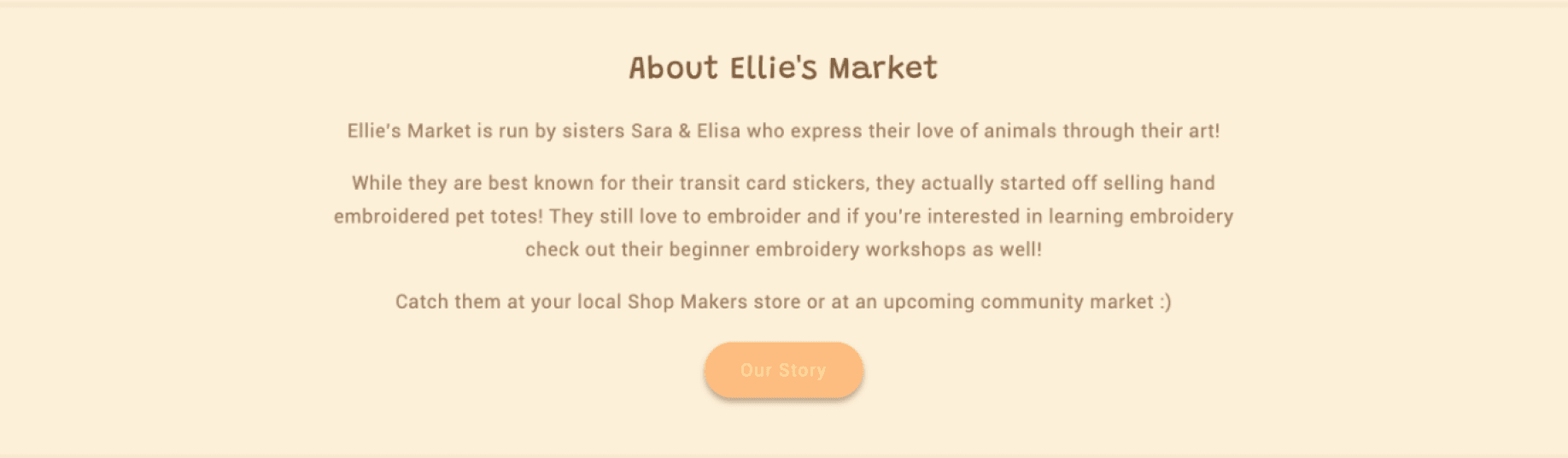
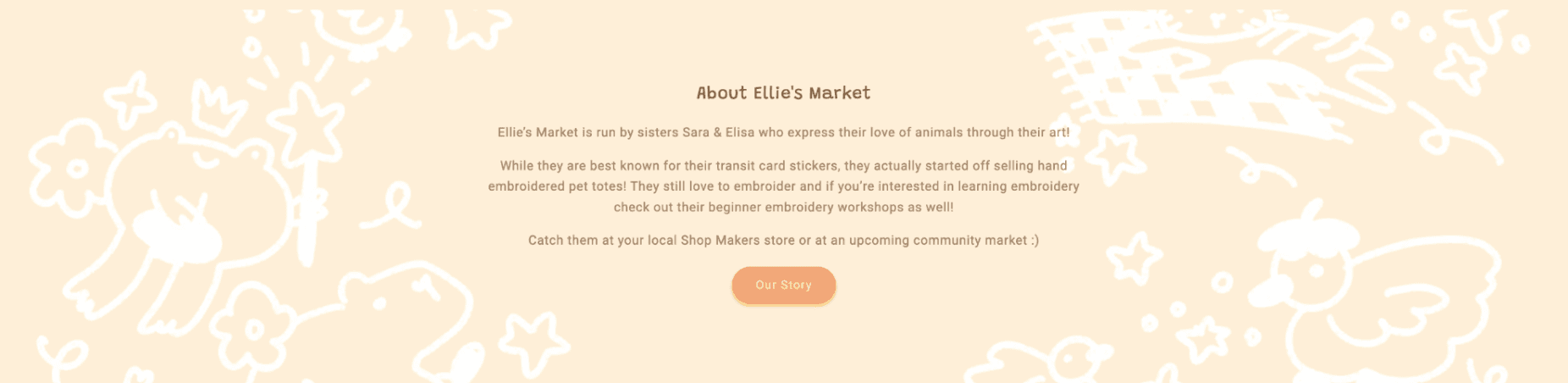
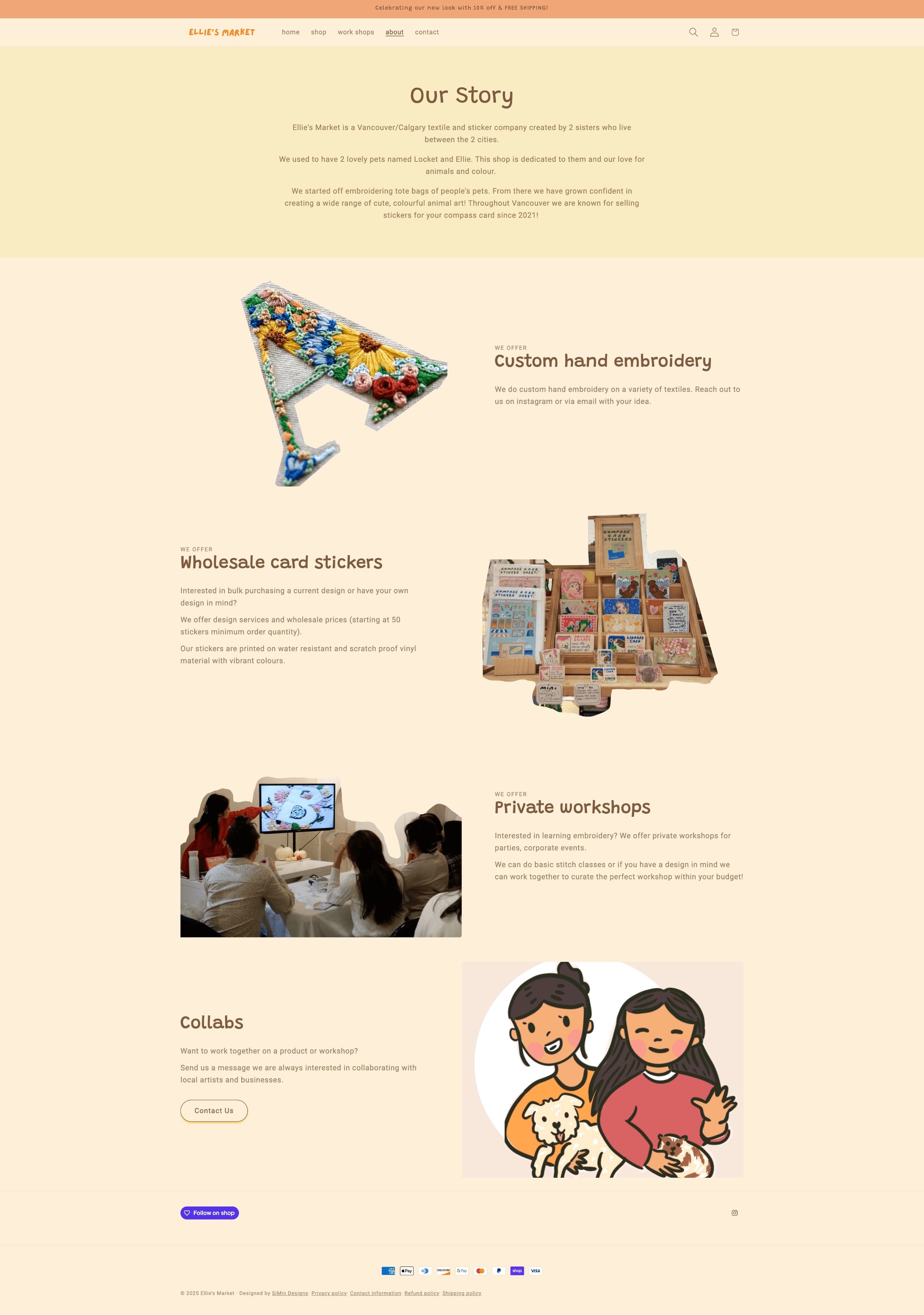
In reviewing the rest of the site, I also noticed that the About section felt a bit too minimal and lacked the brand’s personal flair. To stay true to the brand’s handmade charm, I suggested incorporating the client’s illustration.
Intro Section V1
Intro Section V2
03. Final Products
Landing Page - Desktop
Mobile

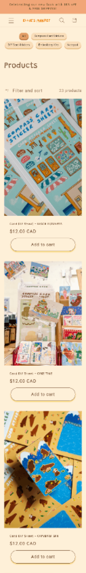
Product Page - Desktop

Mobile
Intro Page - Desktop
Mobile

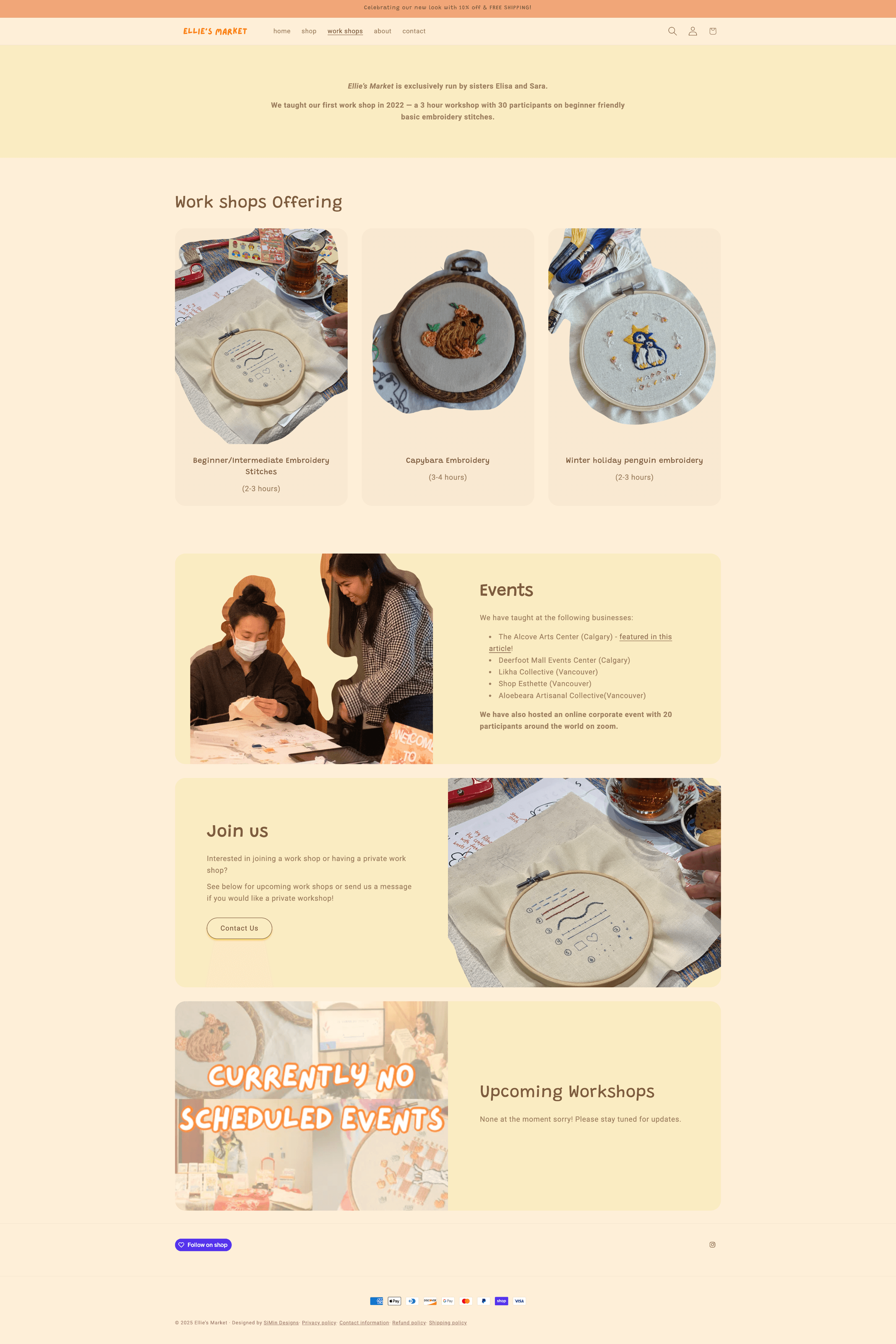
Workshop Page - Desktop
Mobile

04. Reflections
Design is always an iterative process
From wireframes to final build, each version brought new clarity. Staying flexible allowed me to create a better final product.
Compromise is part of real-world design
Whether it was adjusting the site map to simplify navigation or accepting what the platform allowed, I realized that perfect design doesn’t exist in isolation. It’s about finding harmony between brand, user, and tech.