Healthcare Navigation Platform for Newcomers in British Columbia
Role
UI/UX designer
UX researcher
About
This project focuses on making healthcare access simpler and more welcoming for newcomers.
By streamlining healthcare access with multilingual support, step-by-step guidance, and integration with existing healthcare platforms, I designed a centralized hub where healthcare resources are accessible, inclusive, and intuitive for diverse users.

0.1 Why are we making this?
As a newcomer to BC with three years of healthcare experience, I understand firsthand the challenges of navigating the system.
Challenge 1
Navigating an unfamiliar health system
Challenge 2
Language and Cultural Barriers
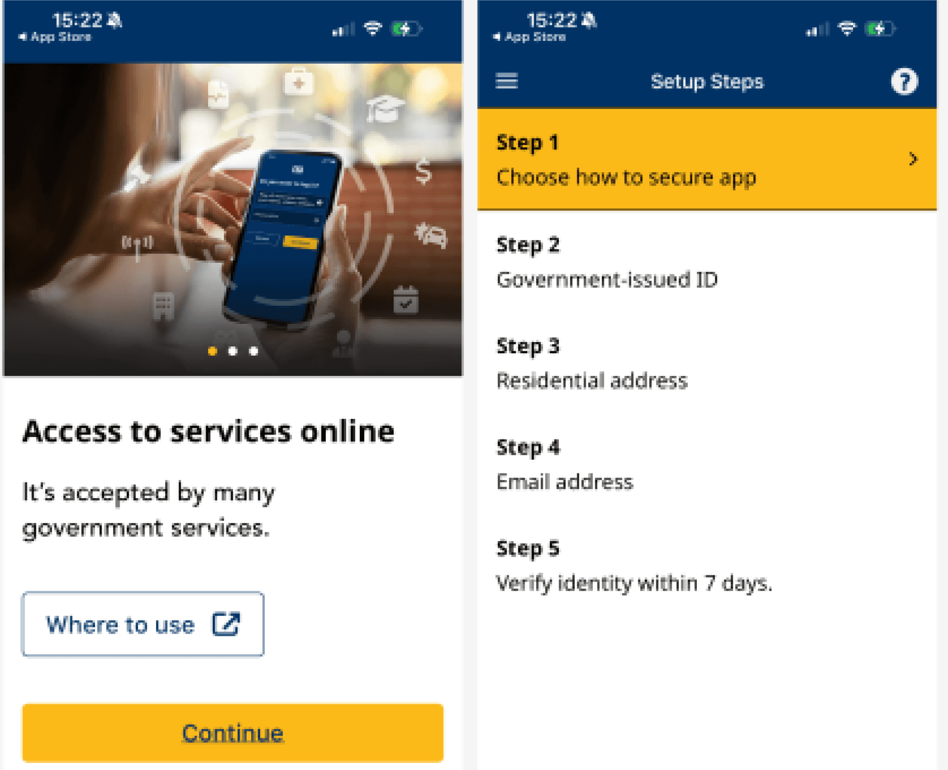
BC Service Card
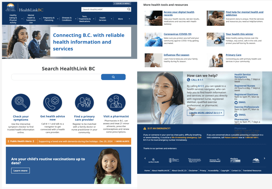
BC HealthLink
02. Research
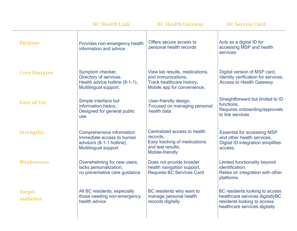
Competitor Research
I compared the 3 existing platforms and found the current healthcare platforms in BC primarily cater to long-term redsidents who are already familiar with the Canadian healthcare system. Newcomers, however, face unique challenges.
Competitor Analysis
Interviews
I interviewed 2 newcomers who arrived in BC within a year.

Dory, Software Developer in her 40s
She recently moved to BC with her family. Dory is excited to build a new life in BC.
CORE NEEDS:
A centralized platform with all the essential healthcare details.
Resources tailored for newcomers and step-by step guides.

Nana, a 26-yr-old groomer
She recently moved to BC by herself.
She is semi-fluent in English and relied heavily on her friends and online resources for help.
CORE NEEDS:
Healthcare materials with simplified language or with translations.
Easy-to-understand tools that expire healthcare process.
03. Planning & Wireframing
Key Insights for Wireframing
Guided by user interviews and competitor research, three priorities emerged for structuring the healthcare platform
Present only essential information to avoid overwhelming newcomers.
Organize content intuitively so that users can move through the platform smoothly and find key services without confusion.
Make translation options and language support highly visible on every page to ensure accessibility for diverse audiences.
Information Architecture
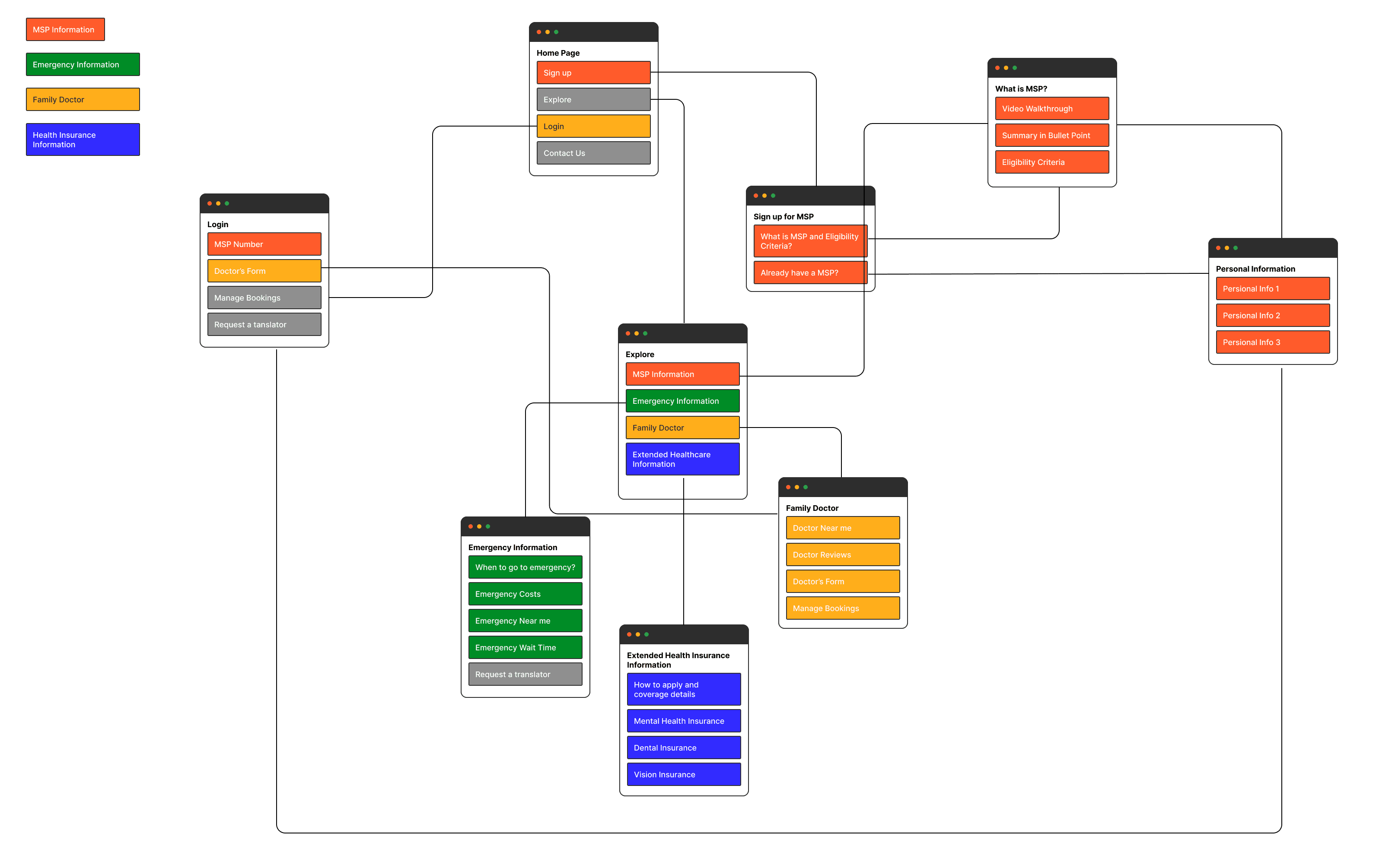
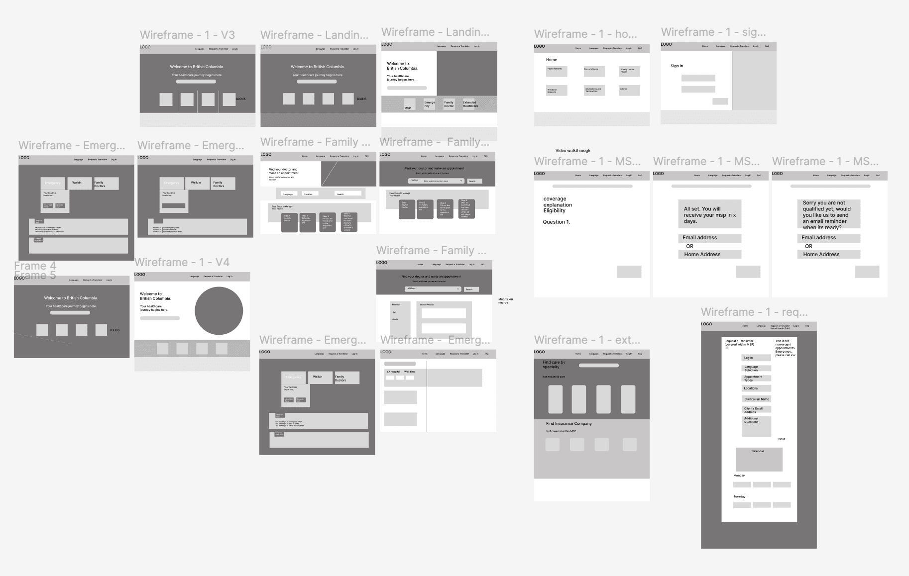
Wireframing
04. Final Products
Homepage & Dashboard

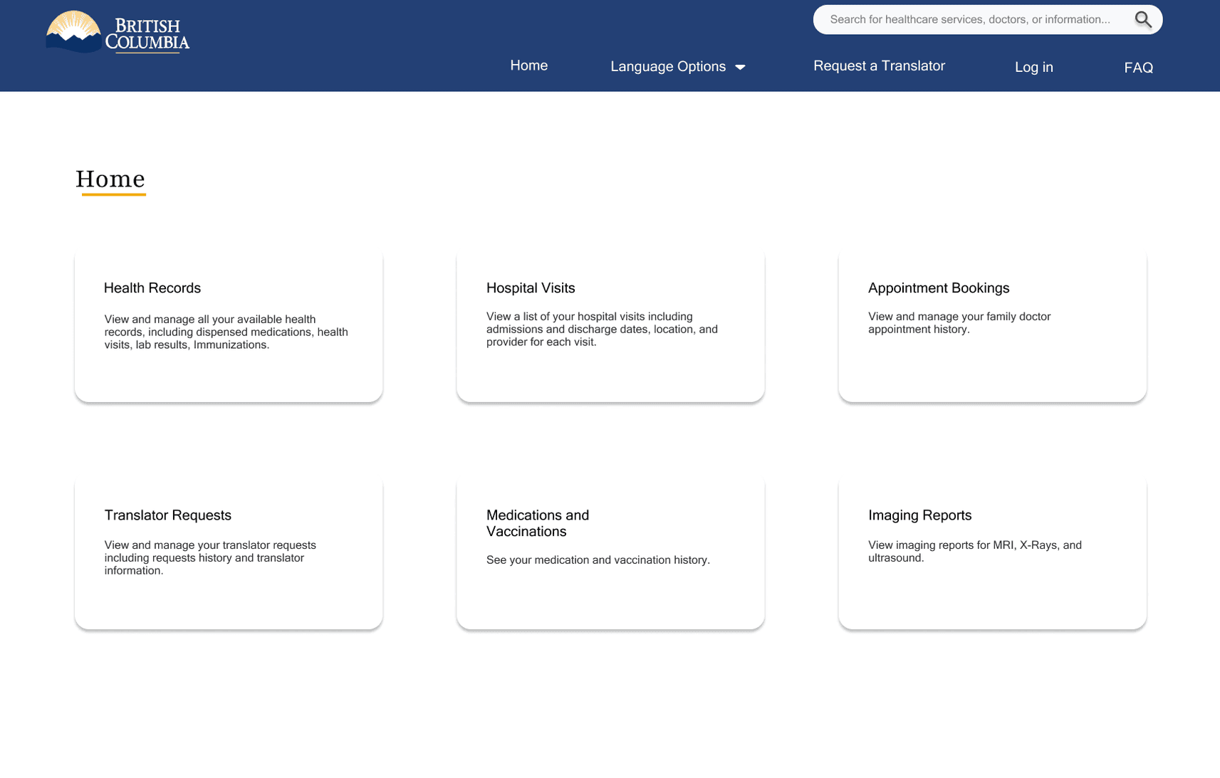
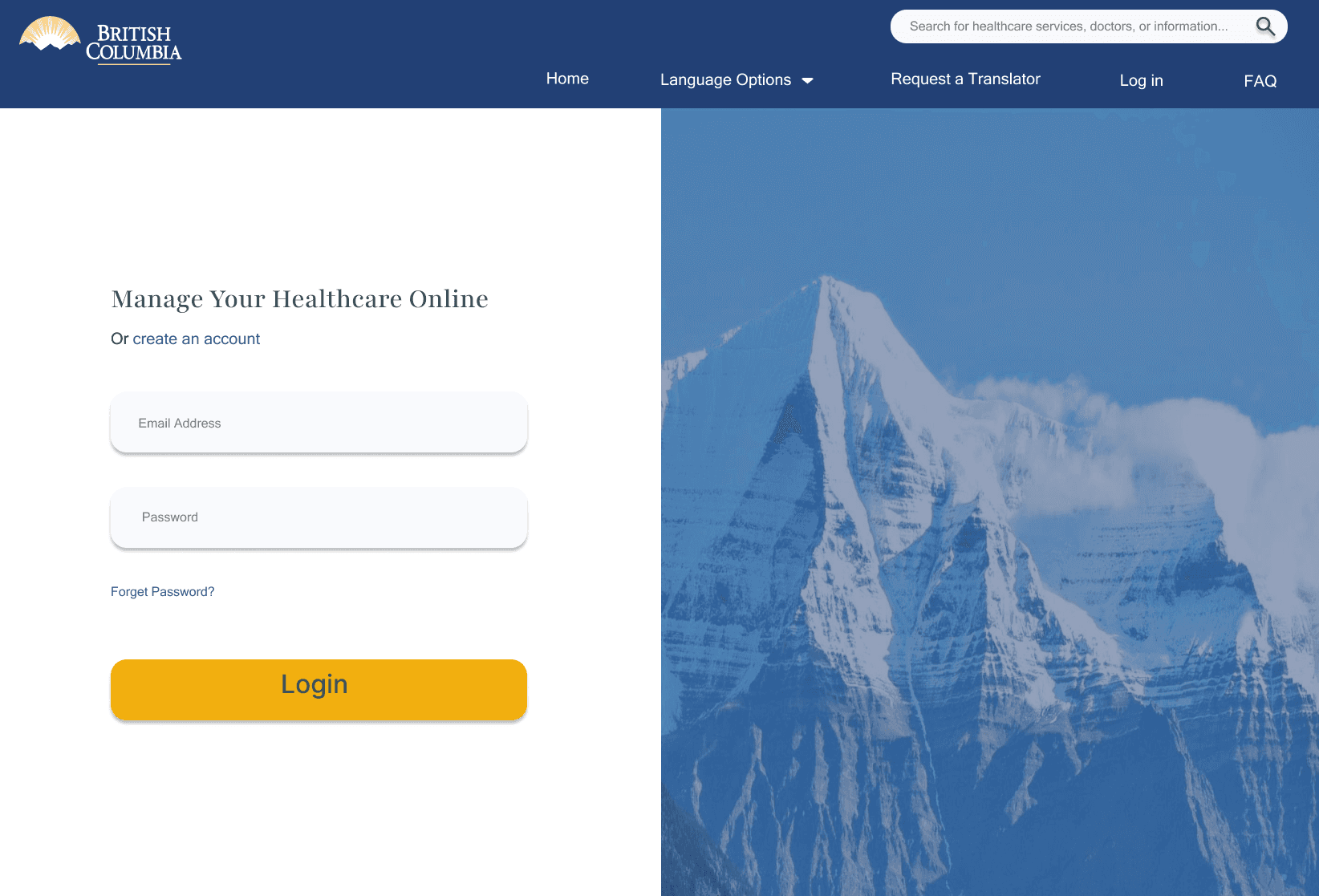
To address Dory’s need for a centralized platform, the redesigned dashboard provides clear entry points to critical services such as MSP registration, emergency care, and family doctor searches, reducing confusion and saving time.
For Nana, who needs simplified language and translation support, new features allow users to request translations for healthcare materials and access doctor’s forms in plain, easy-to-understand language, supporting those with limited English proficiency.
MSP Registration Process
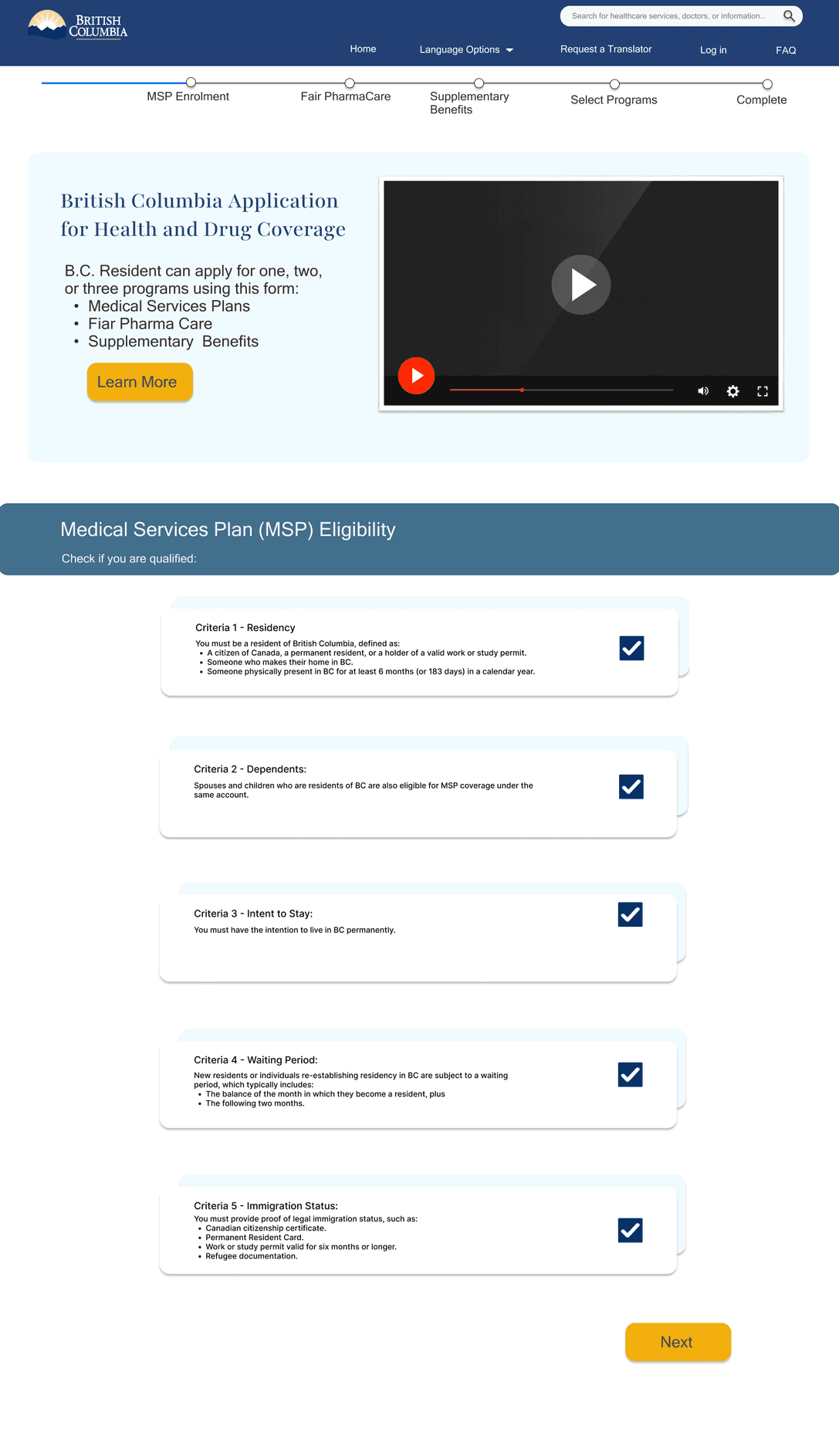
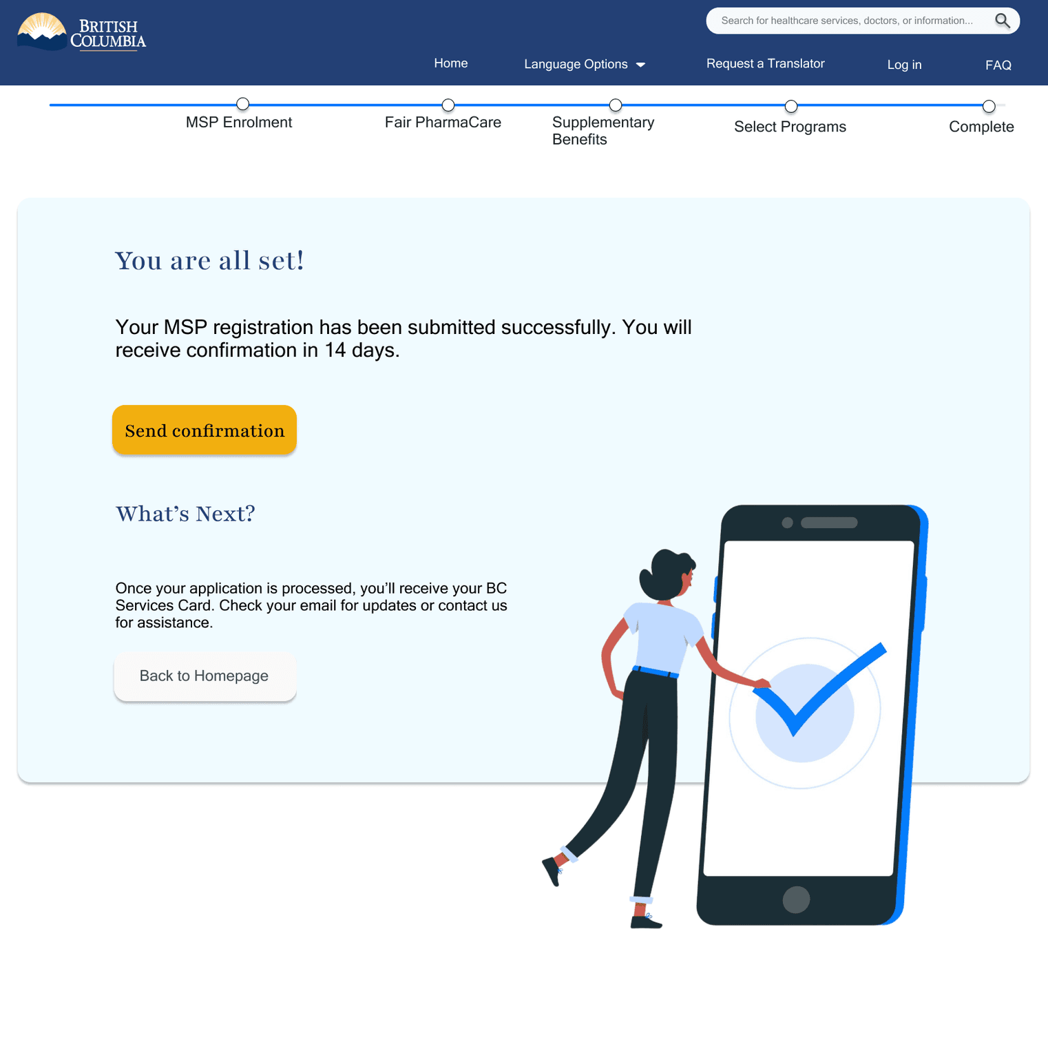
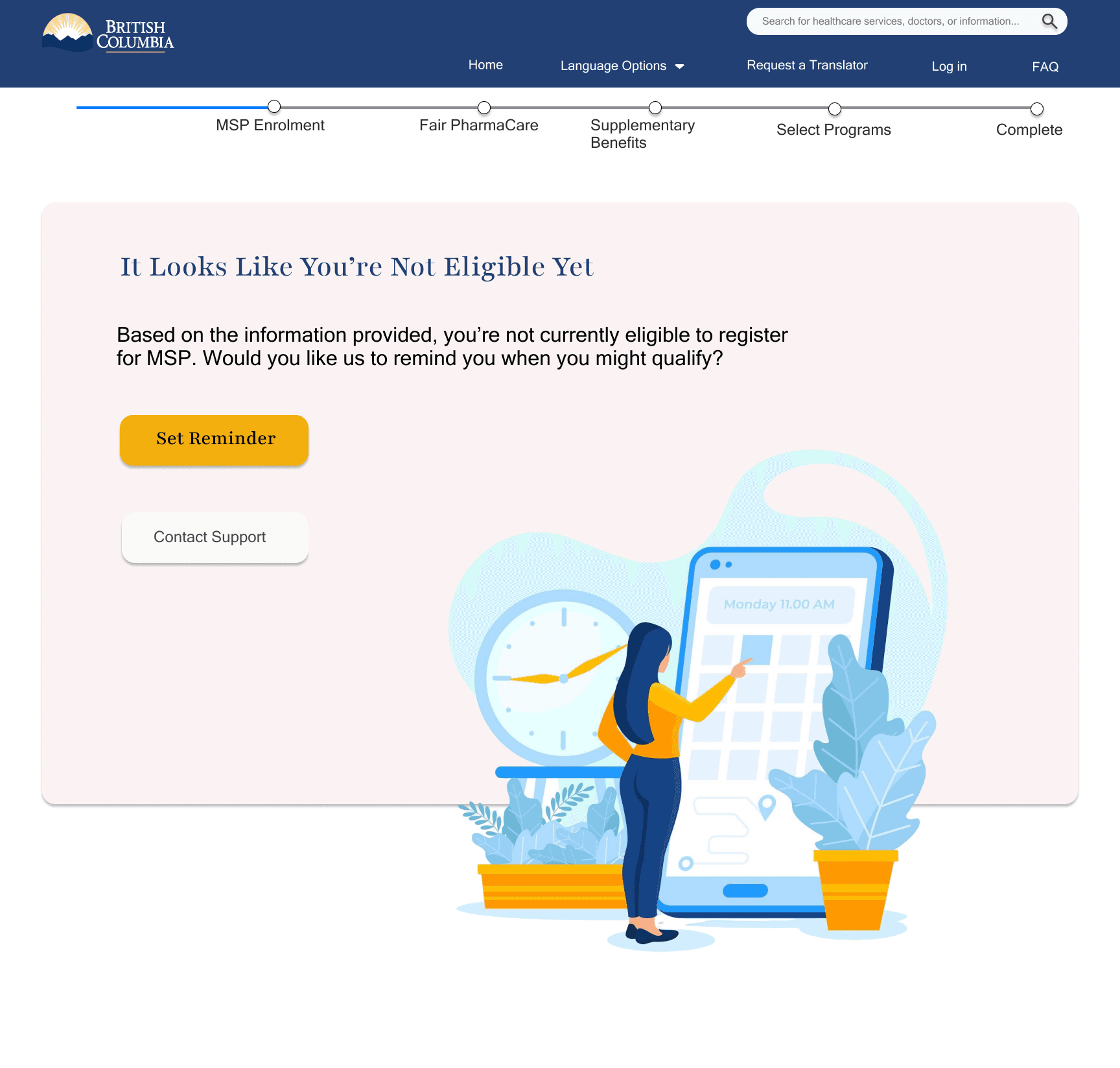
A step-by-step onboarding flow helps newcomers like Dory feel confident navigating the system, supported by a video walkthrough that mirrors how newcomers prefer to learn.
For users like Nana, who benefit from clear reminders and simplified guidance, the platform provides feedback messages and gentle prompts—encouraging them to complete their registration as soon as they are eligible.
Additional Features
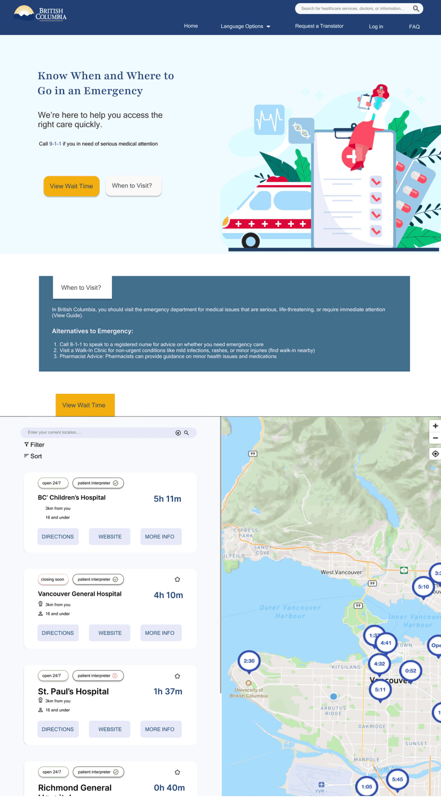
Emergency Care
Extended Healthcare

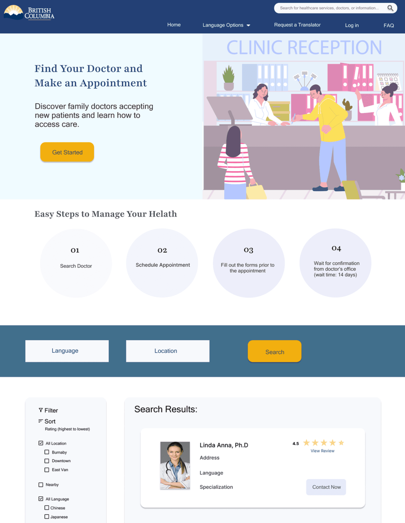
Family Doctor Search
For newcomers like Dory, who want clarity the platform provides straightforward explanations of non-MSP-covered services (such as dental or vision) and direct connections to insurance providers. This gives families a reliable way to plan for extra healthcare costs.
To address Nana’s need for easy-to-understand tools, the family doctor feature provides clear guidelines on how to apply, displays wait times, and integrates with maps for nearby options.
The emergency care section offers step-by-step clarity on what services are covered and where to go in urgent situations. This feature eliminates confusing medical jargon and presenting options clearly.
The user interviews did not include seniors or individuals with accessibility challenges. As a result, the platform may not fully address the needs of these populations.
Mobile version is needed and will be explored in future.